Designing for everyone: The ISOTYPE legacy in Schiphol’s wayfinding system
Katharina Trummer
In a world where public spaces bring together people from diverse linguistic and cultural backgrounds, we are, now more than ever, reliant on ways of communicating that transcend such boundaries. In places like airports, train stations and hospitals communication can’t rely on text alone. In such environments, the need for a universal language, which is rooted in symbols and visuals instead of words, becomes not just helpful, but essential.
Taking Schiphol as an example, where countless travellers pass through every day, words would not suffice as a wayfinding system. To guide passengers through gates and terminals or security checks, Schiphol uses a carefully designed system of pictograms that function as a universally understood visual language. This approach didn’t appear out of nowhere but is, as I suggest, rooted in ISOTYPE: a visual communication system developed nearly a century ago, initiated by Otto Neurath.
The Fundamentals of the ISOTYPE
ISOTYPE, short for the International System of Typographic Picture Education, was built on the idea that pictures could serve as a kind of universal language. As one of the most influential systems of its kind, it was designed to create clear and memorable pictograms that conveyed a universally understood meaning. The ISOTYPE serves as an implicit foundation of visual communication strategies used in public spaces today, as exemplified Schiphol Airport.
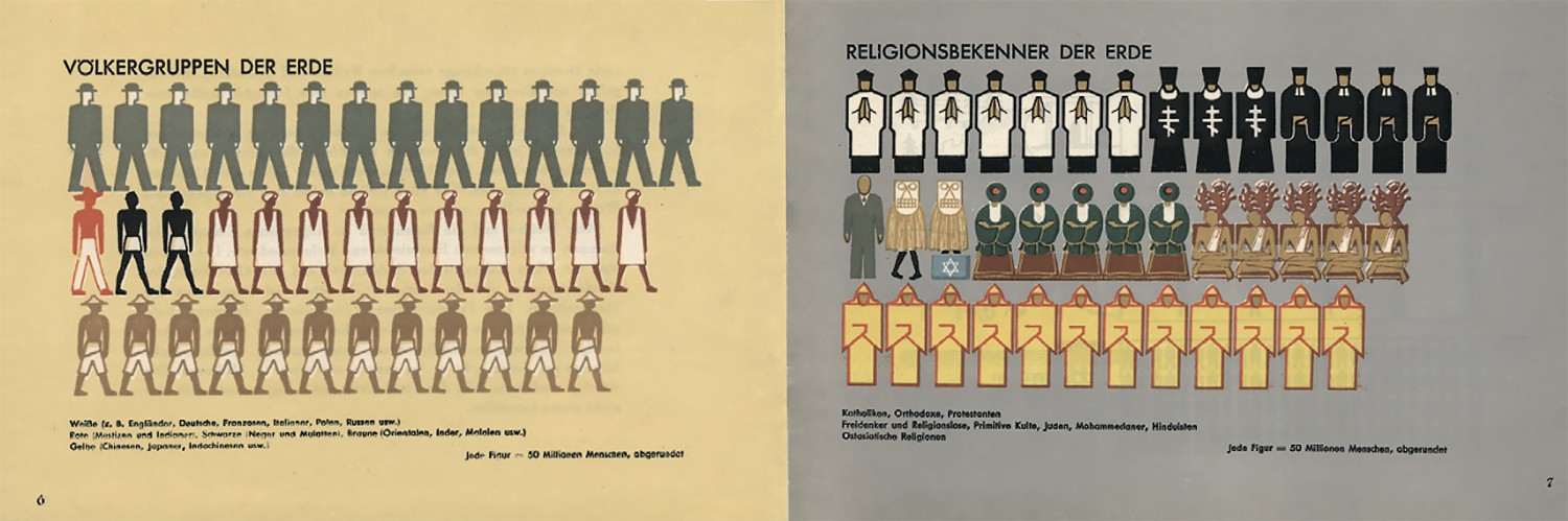
The ISOTYPE began to take shape in the 1920s and 1930s as a project led by Otto Neurath, who explored new ways to make complex data more approachable to the general public. He set up the Gesellschafts- and Wirtschaftsmuseum (Social and Economic Museum) in Vienna to serve as a space to educate ordinary citizens about social and economic issues through visual means. His early developments became known as the Vienna Method of Pictorial Statistics and used simple silhouettes to represent statistical information about unemployment, health and, emigration. To make data easier to understand, Neurath developed a set of pictograms designed to represent facts visually, emphasizing that each chart should be tailored specifically to their content rather than relying on the standardized set. This system was particularly helpful for immigrants and uneducated workers, giving them access to information critical for the newly formed democratic society. The ISOTYPE was a socially driven mission which aimed to communicate vital information in a way that was accessible to everyone, especially the working class.
The key turning point came with Neurath’s collaboration with German graphic designer Gerd Arntz, who refined the system’s visual language. Arntz created a consistent set of simplified, reproducible figures that were used to express statistical data. These pictorial symbols served a greater function: they condensed material into swift, visual summaries that could be understood at a glance. Arntz’s work offered a more comprehensible view of social realities without overwhelming or excluding the less educated audience. This way, the system allowed for a balance between presenting scientific facts clearly and making such information widely accessible.
While originally developed in the 1920s and 30s for statistical representation, Neurath’s envisioned pictograms could serve beyond their intended use. He recognized that pictograms could be applied in the public space, enhancing the clarity in situations limited by space, urgency or linguistic diversity. After its initial applications in informative chars displayed in journals and exhibitions, Neurath’s former collaborator Rudolf Modley- who emigrated to the United States- further applies the strategy in rather economic environments. He became an advocate for pictorial systems, appropriating the ISOTYPE system, to communicate corporate information. By the 1950s he laid the foundation for the use of picograms as a universal language, and formalized sets of icons in manuals such as ‘Handbook of pictorial symbols’ (1976). Although Modley’s efforts lacked institutional support, the demand for visual language continued to grow- specifically as globalization accelerated. By the 1960’s the increased movement of people and the growing number of major events highlighted the need for a standardized set of pictograms to bridge linguistic and cultural divides.
The Case of Schiphol
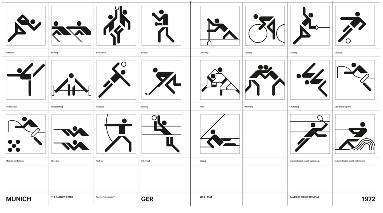
This heightened demand paved the way for the 1972 Munich Olympics, which marked a watershed event in the growth of pictographic design. Organizers faced the challenge of guiding millions of international visitors through unfamiliar places. This marked a turning point in expanding the ISOTYPE’s educational goals into a broader communicative language. The symbols needed to convey actions and direction across language and cultural boundaries.
The pictograms designed by Gerhard Joksch & Otl Aicher for the Olympic Games in Munich in 1972, for example, demonstrated that these pictograms might serve as a real public language. It demonstrated that these pictograms might serve as a universal public language that is clear, immediate, and international. That realisation would have a great impact, affecting design in transit hubs, sport arenas, and municipal signs globally. Thus, the principles of the ISOTYPE went on to be applied in modern infrastructure, from sports venues to airports. One of the most influential and early applications of this system can be found in the wayfinding system at Schiphol Airport in Amsterdam. In the early 1990s it became one of the first airports to integrate a signage strategy involving clear and consistent pictograms to make the space accessible.
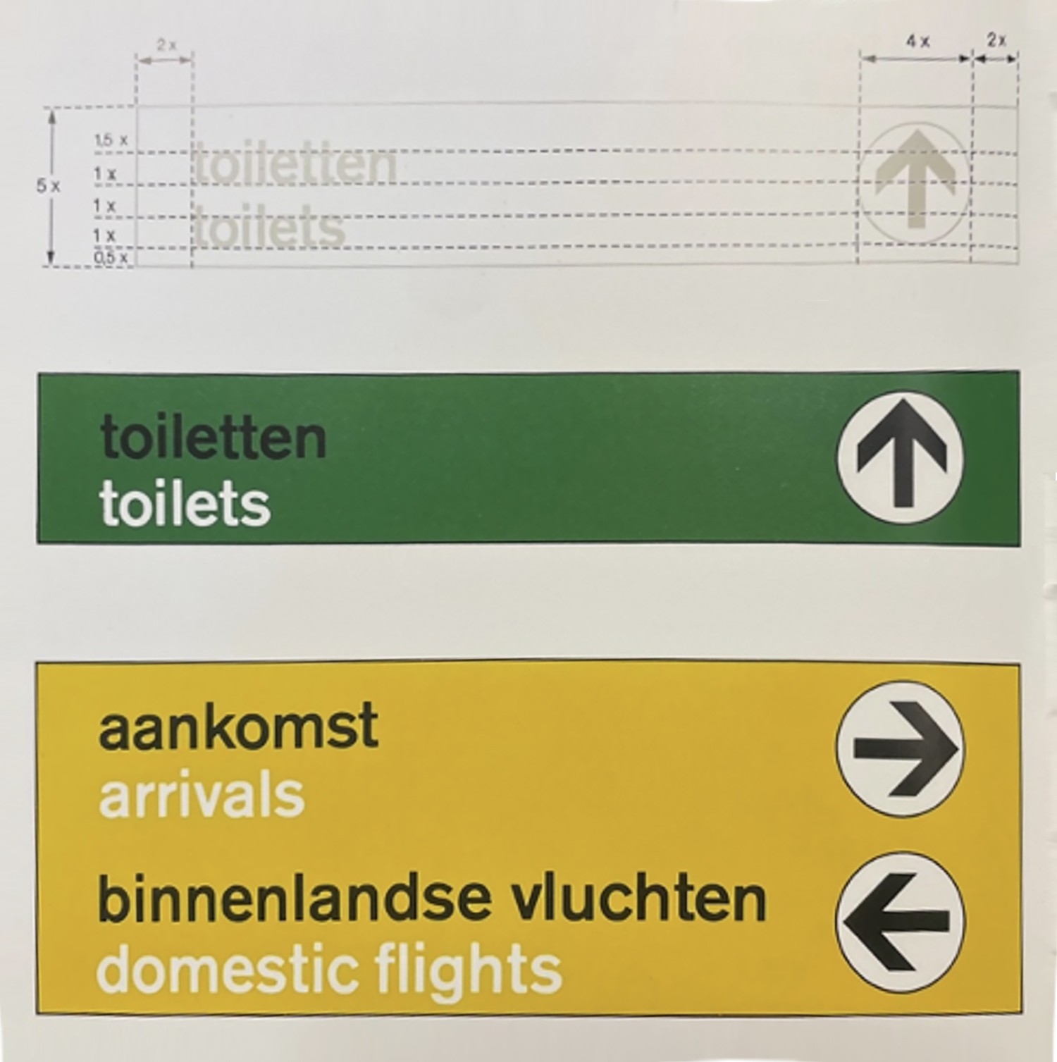
Schiphol Airport offers one of the best examples of how visual design can make unfamiliar environments clearer. In 1967, the designer Benno Wissing, guided by the motto “passengers first” created a groundbreaking signage system that was based on simplicity, clarity and user orientation. The color-coded scheme- yellow signs for arrivals and departures, green for secondary services like restrooms and cafes- can still be seen in the airport today. This was a progressive move at that time and later influenced the airports in Heathrow and Singapore.
In the 1990s, the design studio Mijksenaar was brought in to rebrand this signage system in Schiphol. The revised system introduced internationally recognizable symbols, also referred to as “pictograms.” These were drawn from an internationally standardized set of symbols but adapted to meet the needs of Schiphol airport. The symbols were universally recognizable, which was central to a space which needed to guide travelers with different backgrounds. Mijksenaar’s key contribution, however, was ensuring the consistency in all signs, from gate number to directional arrows. Introducing this as the norm was crucial to reduce any confusion or visual clutter. The aim was to make information instantly legible, resembling the original intent of the ISOTYPE to communicate at a glance.
To support the unique and ever-changing rhythm of Schiphol airport, the pictograms were carefully adapted in terms of symbols, typography and layout. Those aspects that are essential for an airport nowadays to cut through chaos and introduce consistency. Typography played a crucial role Schiphol’s legibility strategy. The designers chose Frutiger, a clean, sans-serif typeface that catches the attention of the travellers. It remains readable form a far-away distance and is built for clarity. Furthermore, language was handled with a global mindset. English was prioritized, with Dutch translations below, which simplified signage while maintain accessibility.
The ISOTYPE’s Legacy in Motion: From Charts to Terminals
After Otto Neurath’s death in 1945, his wife Marie Neurath, who participated in the project from the start, continued the work of the ISOTYPE institute. She carried on his legacy with a strong emphasis on children’s books and literacy campaigns. With the diffusion of the institute in 1971 the ISOTYPES system began to spread, taking root in unexpected places: from educational children’s books to campaigns of signage on the road signs and museums. The ISOTYPE’s core principles began to influence graphic designers who saw the power of the visual clarity of the system. It transformed from a method to a design language now seen across a wide range of spaces- from airports to museums.
Taken together, Schiphol’s signage demonstrates the mastery of visual communication. The signage ensures for a clear and accessible environment that even first- time visitors can navigate. It shows the power of visual communication to create spaces that are clear, navigable and welcoming to all. This design doesn’t just echo the ISOTYPE’s principles but amplifies them to come closer to the ideal version of a universal language. In Schiphol, we can see Neurath’s vision in action: a universal visual language that is integrated into the architecture of everyday life. It achieves a balance between function and accessibility, where every symbol, colour and typeface have a purpose. The airport demonstrates how a well thought out design can overcome language and cultural barriers, turning confusion into claitry. The ISOTYPE laid the groundwork, and Schiphol serves as the proof on how far this foundation can go.
_______
Katharina Trummer is a Master student in Communication and Information Studies at the University of Amsterdam. In her writing, she explores the intersection of design, public space and visual communication, focussing on how these elements shape accessibility and shared experiences.
_______
This shortened article is part of a series of student papers written for the course "Graphic Design as a Mediator in Public Space," taught by Richard Niessen and Kylièn Bergh, fellows of the Wim Crouwel Institute.
Sources
Burke, Christopher, and Günther Sandner. 2024. History and Legacy of Isotype. London: Bloomsbury Visual Arts.
Hartmann, Frank. 2008. “Visualizing Social Facts: Otto Neurath's ISOTYPE Project”. In European Modernism and the Information Society: Informing the Present, Understanding the Past: 279-293.
Jansen, W. 2009. “Neurath, Arntz and ISOTYPE: The Legacy in Art, Design and Statistics.” Journal of Design History 22 (3): 227–42. https://doi.org/10.1093/jdh/epp015.
Mijksenaar, Paul. 1997. Visual Function: An Introduction to Information Design. New York: Princeton Architectural Press. 2008. Wayfinding at Schiphol. Breda: Graphic Design Museum.
Navarro, María Del Mar. 2025. “Isotype in Mexico: The Untold Story.” She Ji: The Journal of Design, Economics, and Innovation 11 (1): 7–30. https://doi.org/10.1016/j.sheji.2025.01.001.
Tijus, Charles, Javier Barcenilla, Brigitte Cambon De Lavalette, and Jean-Guy Meunier. 2007. “Chapter 2: The Design, Understanding and Usage of Pictograms.” In Written Documents in the Workplace, edited by Denis Alamargot, Patrice Terrier, and Jean-Marie Cellier, 17–31. BRILL. https://doi.org/10.1163/9789004253254_003.